Premium Beauty Salon Interior Design Case Study: 100% Color and Light Matching
Interior Designer Liliya Safargaliyeva Explains Why Experienced Designers Choose Planoplan
- 29 may 2026
- 1560
Precise light temperature adjustment and photorealistic visualization helped designer Liliya Safargaliyeva convince her client and achieve the perfect burgundy-berry wall color, matching the render 1:1. Here‘s how Planoplan succeeds where other tools fall short.
Our expert today: Liliya Safargaliyeva — an interior designer with years of experience and refined taste. She creates aesthetics and comfort in residential and commercial interiors across Russia, and as a hobby works with neural networks and landscape design. Recently, Liliya discovered Planoplan and is already planning to launch a training course on the software — she so highly values its capabilities for precise preparation of working documentation.
About this case study: We spoke with Liliya about her newly completed project — the premium beauty salon Studio Girls in Orenburg. You’ll learn how with Planoplan you can not only create a beautiful image but also eliminate errors when reproducing complex berry and beige shades and multi-level lighting.

“Expectation vs Reality”: How We Conquered the Fear of Red Color
– Liliya, they say commercial projects are more complex than residential because the responsibility to the business is higher. Your beauty salon spans 160 sq. m of main areas plus 400 sq. m of medical offices. How did the collaboration start and how did you come to Planoplan?
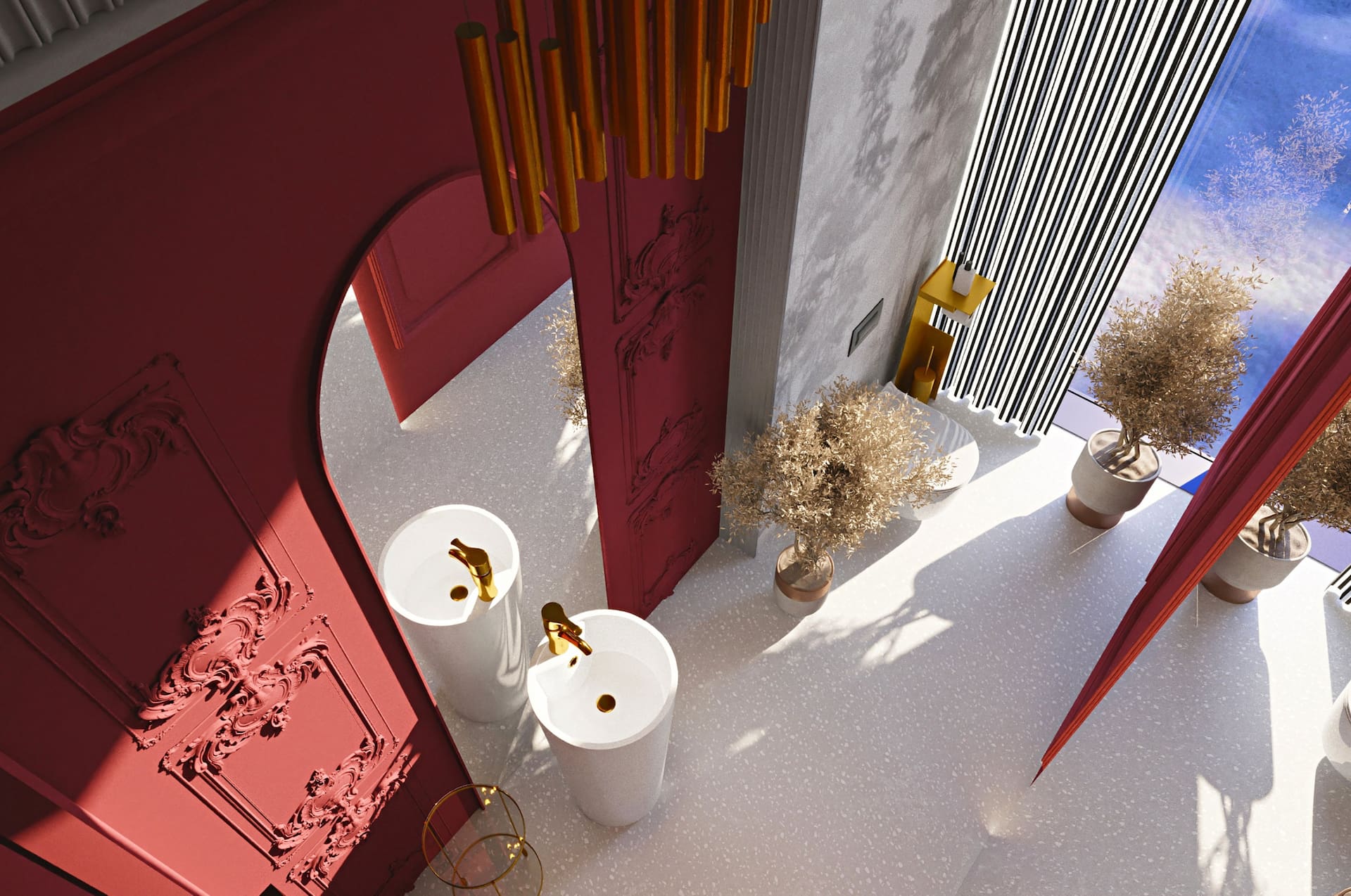
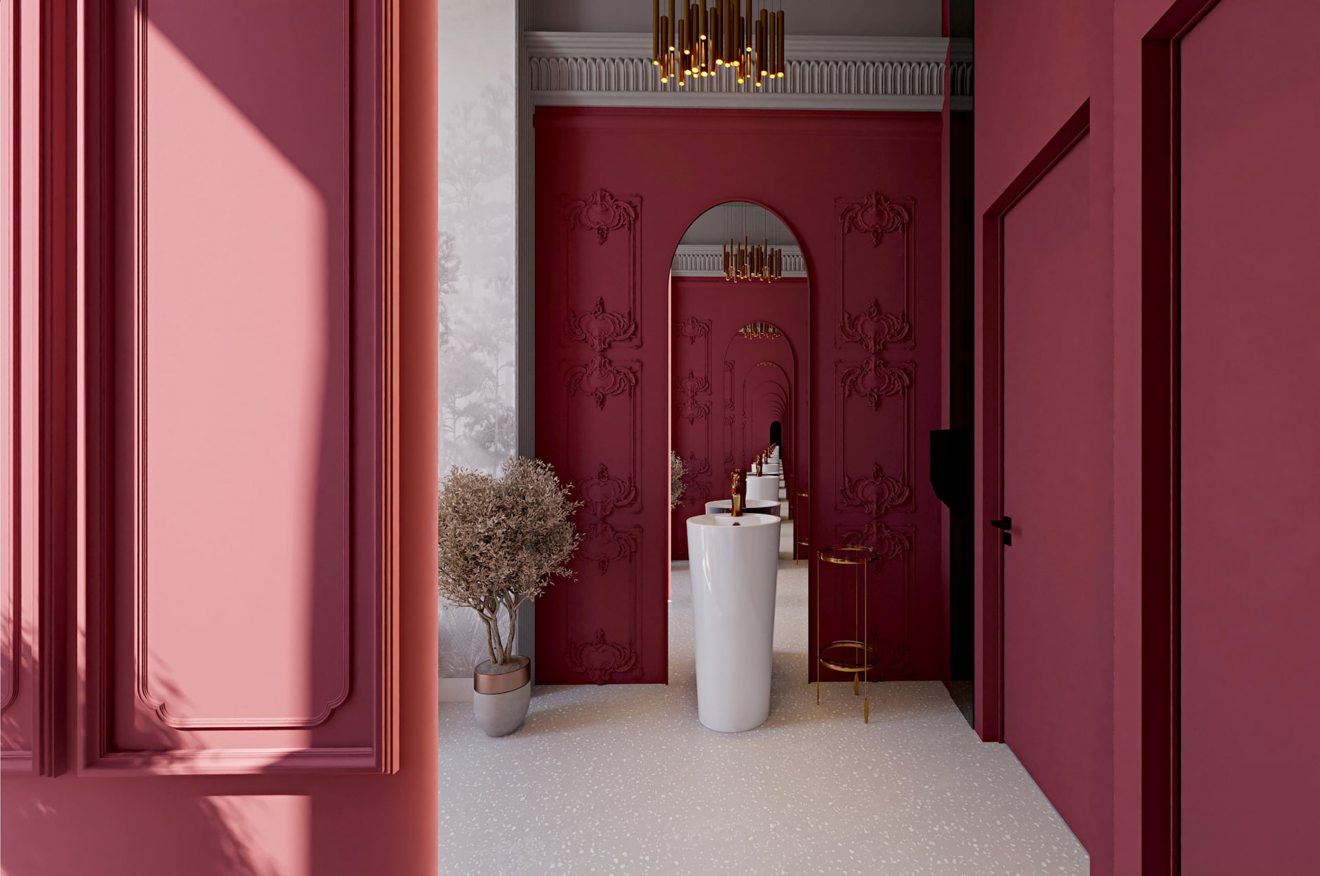
This is the Studio Girls project in Orenburg. The client is a bold woman, but she had one big fear. She wanted beige without any yellow undertone — which is the most common problem for those who have experience painting walls with custom-tinted paints aiming for that noble, rich, luxurious beige. In almost 99% of cases, the chosen shade for tinting and subsequent application to the wall does not match the intended design and the desired hue. Also, we designed the guest restroom in a deep, rich berry-burgundy wall color, but the client was afraid that in reality the color would ‘shift’ into aggressive red or brick — which could have happened if, thanks to Planoplan, we hadn‘t decided to experiment with different lighting temperatures and, before implementation, find the exact answer for how to achieve that very shade both for the beige and the burgundy. These were colors that were already clear in our imagination, but that imagination had to be projected into reality.
Beauty salon waiting area and Instagram-worthy photo zone with hanging swings. Aesthetic interior with cozy armchairs, dusty pink color, decorative wall molding, stylish decor:
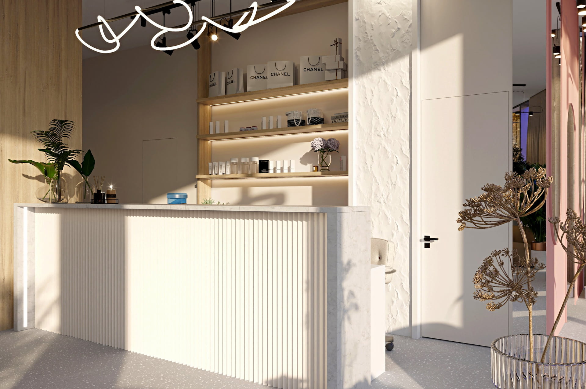
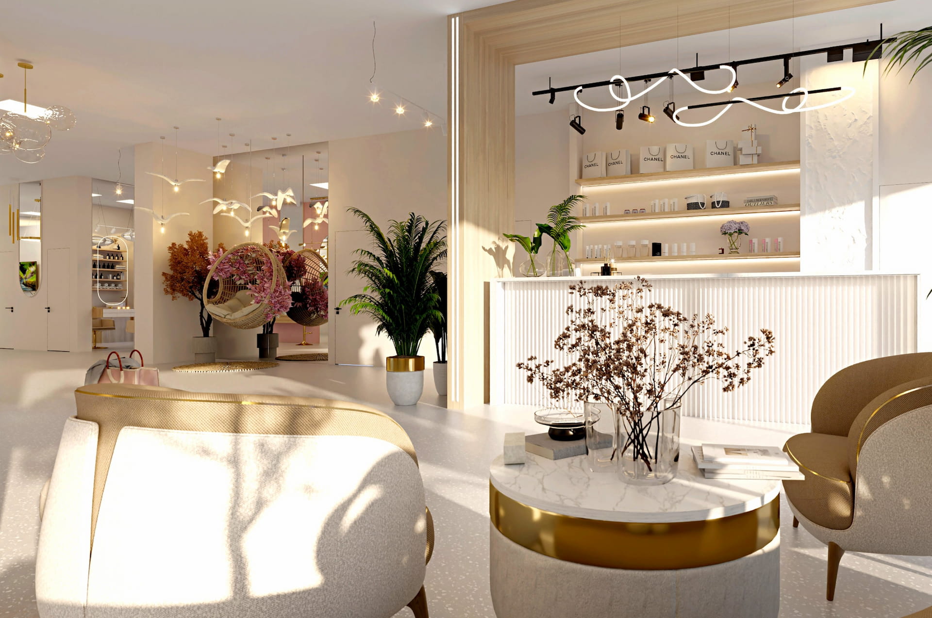
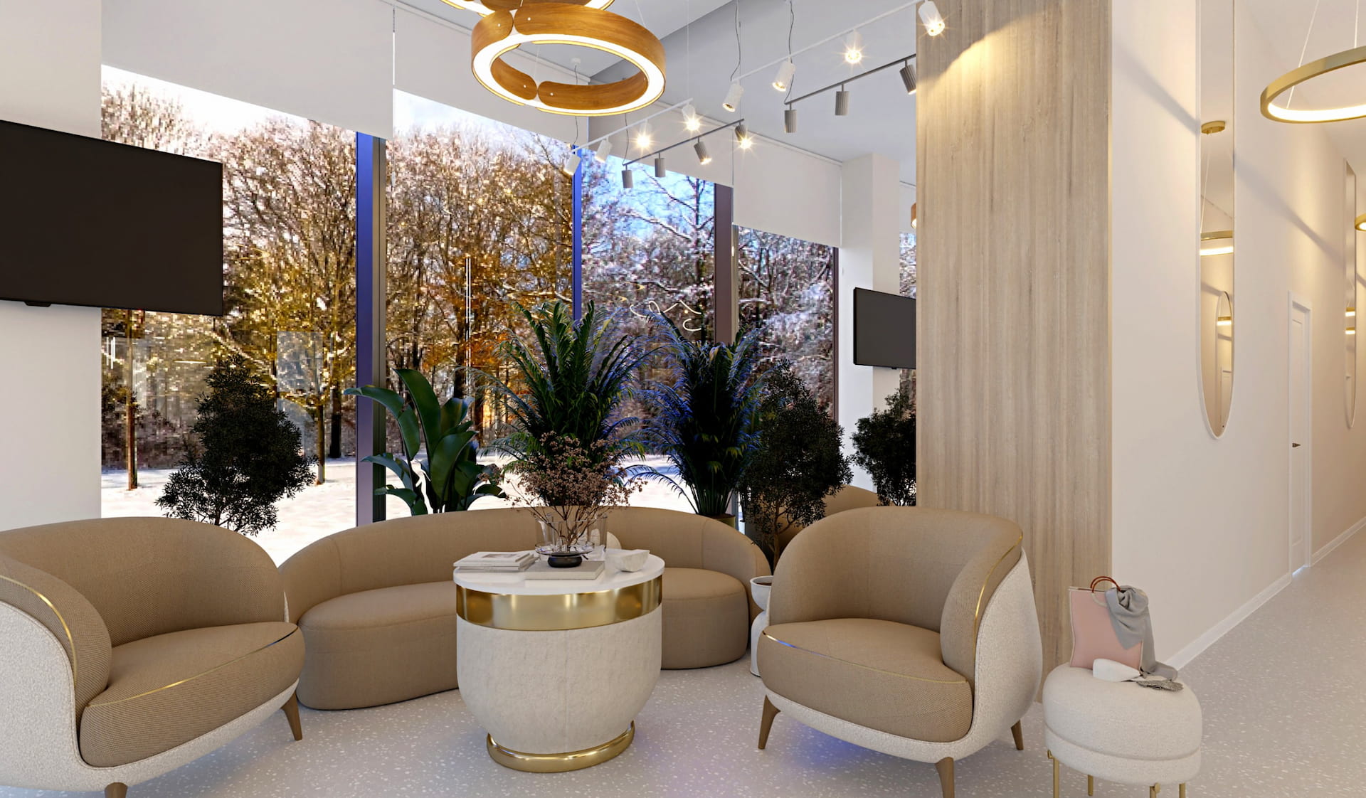
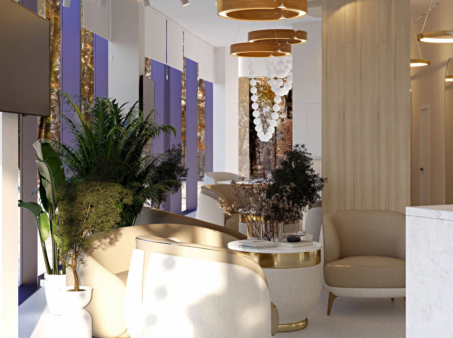
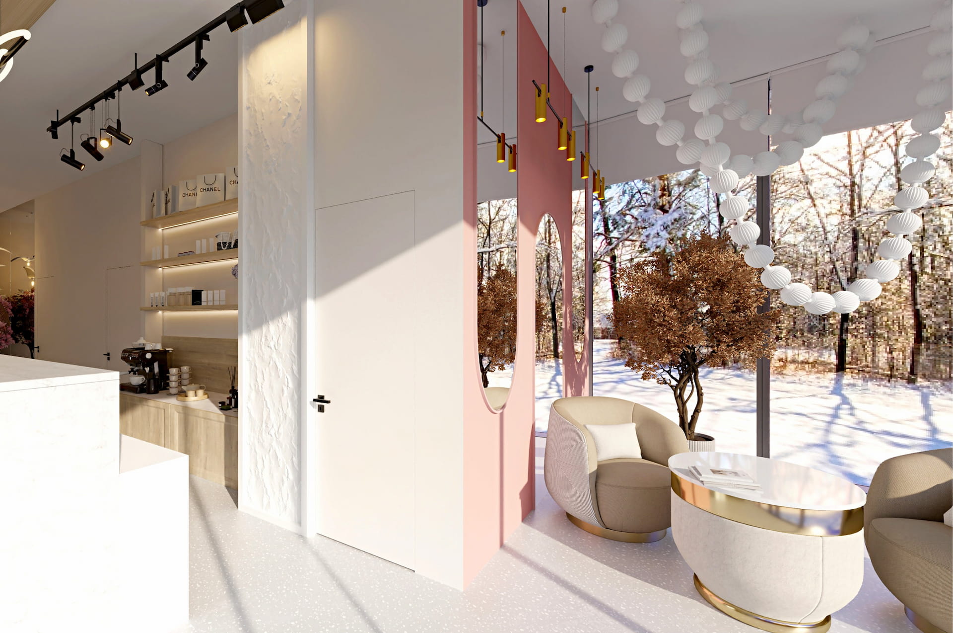
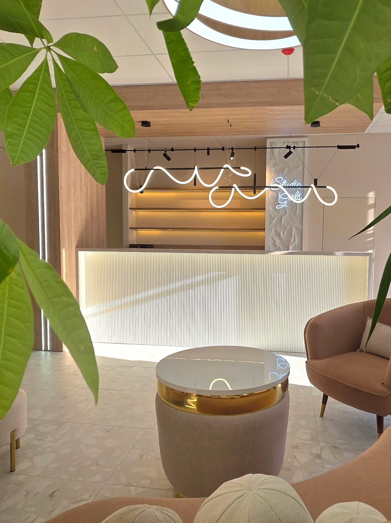
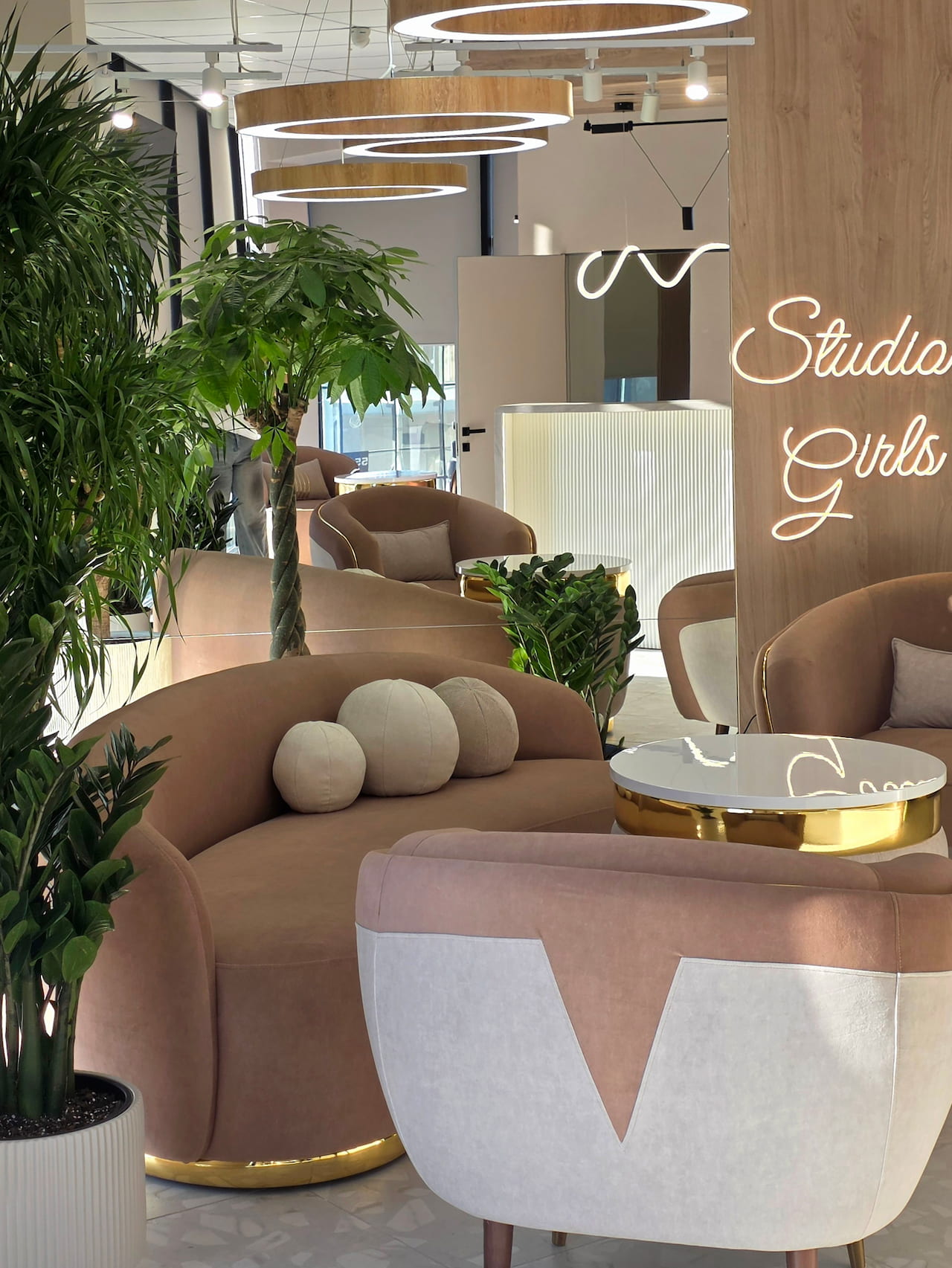
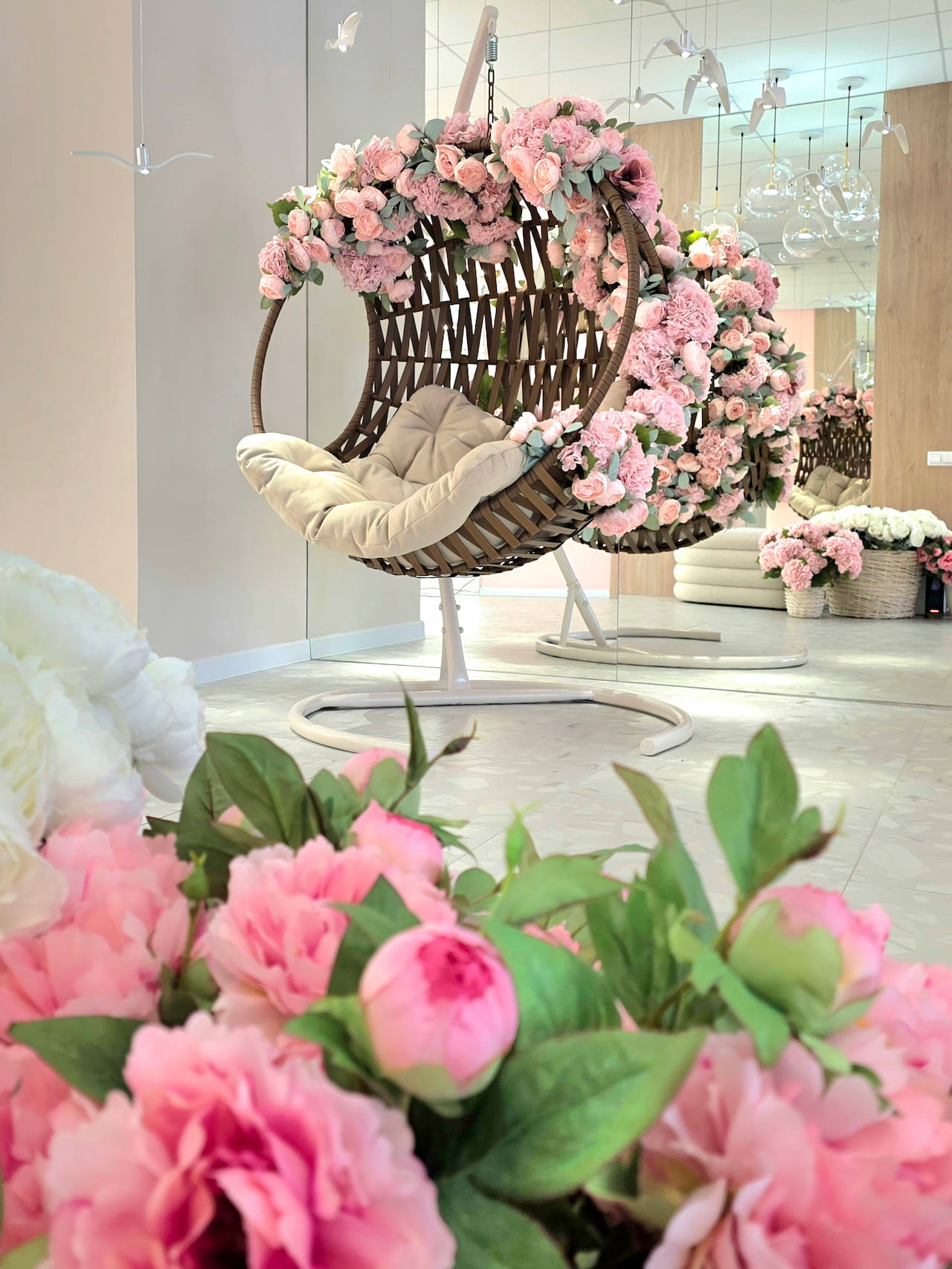
Workstations for beauty professionals. Professional lighting, large mirrors, ergonomic furniture:
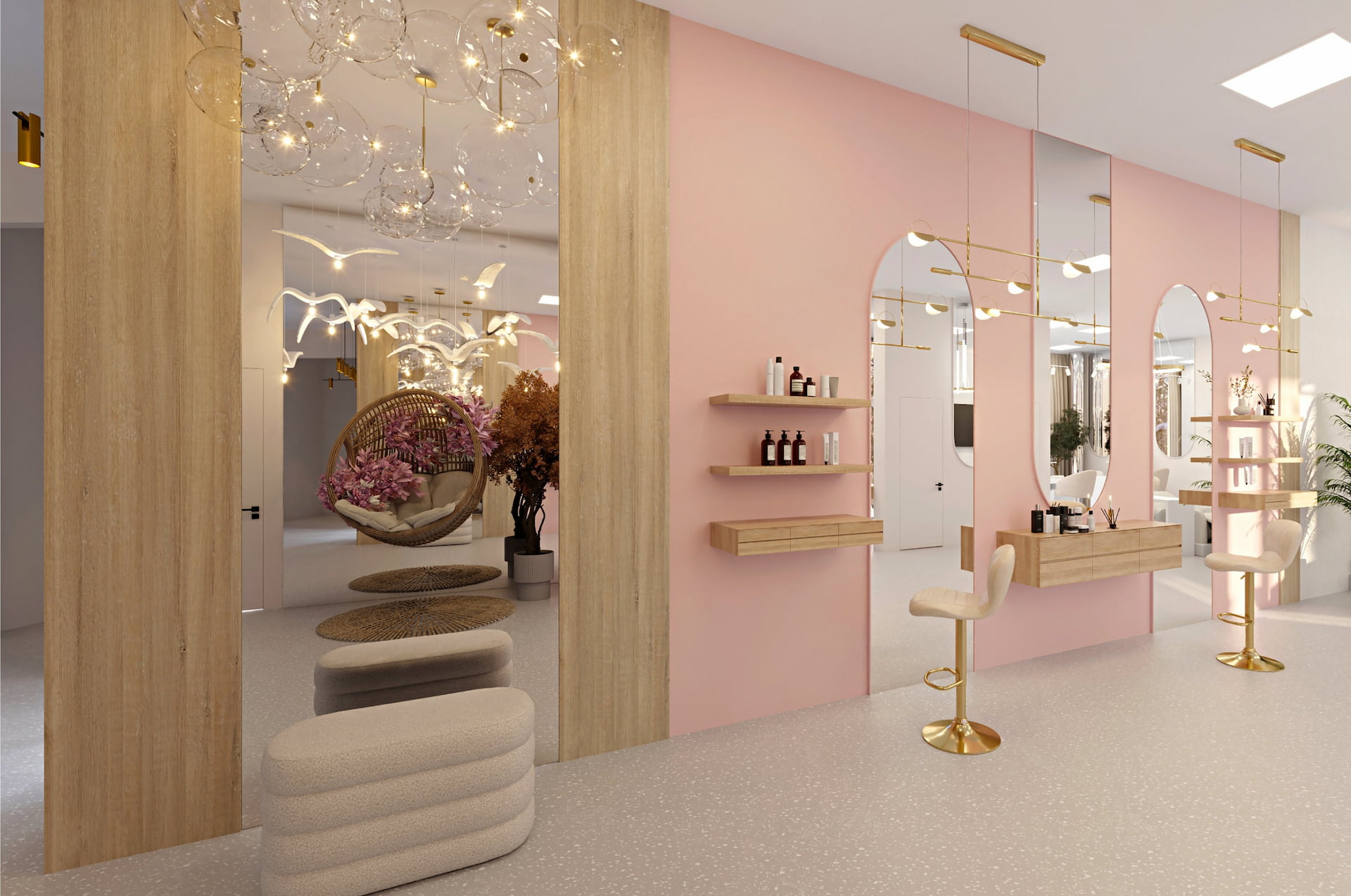

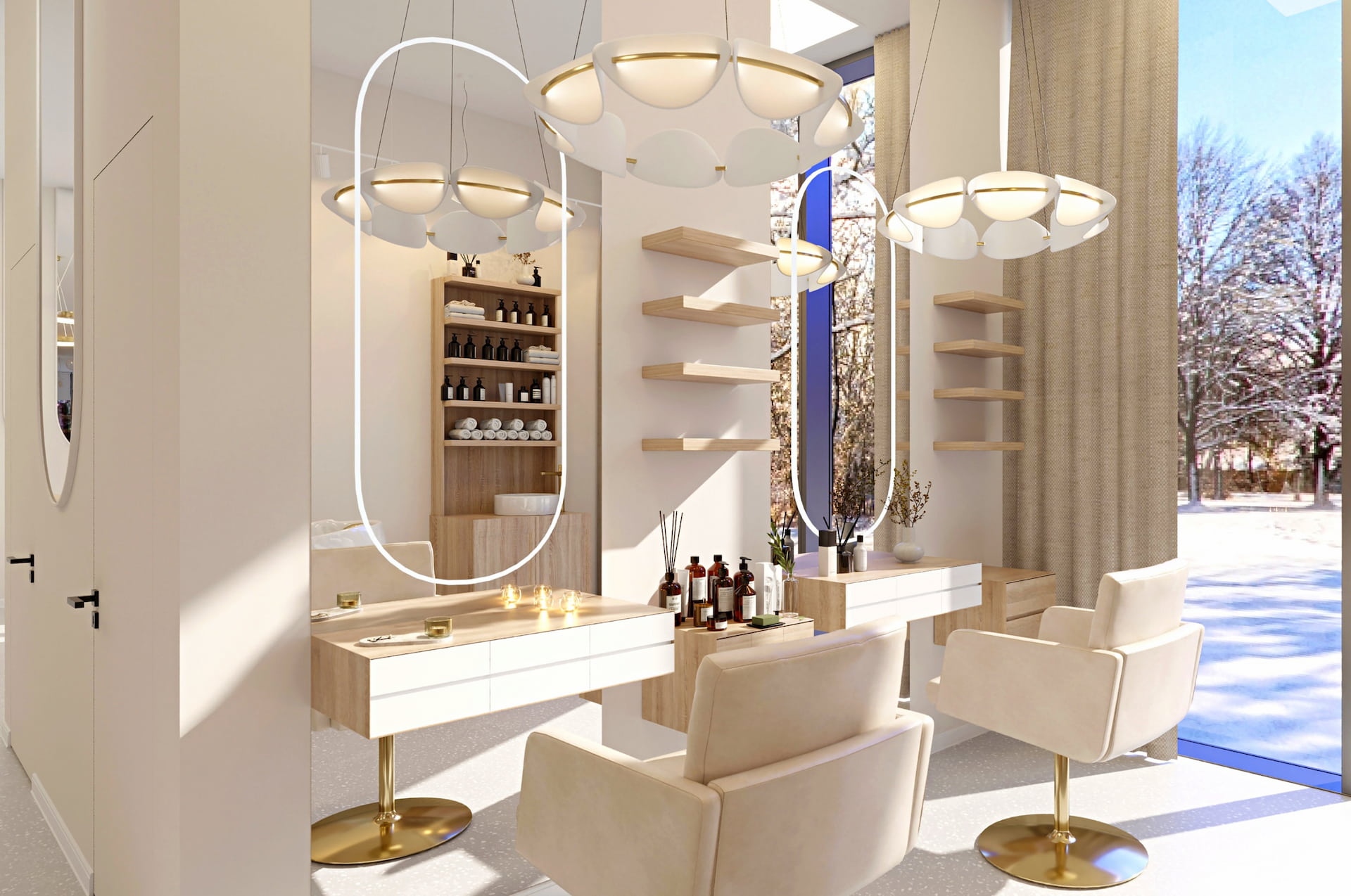
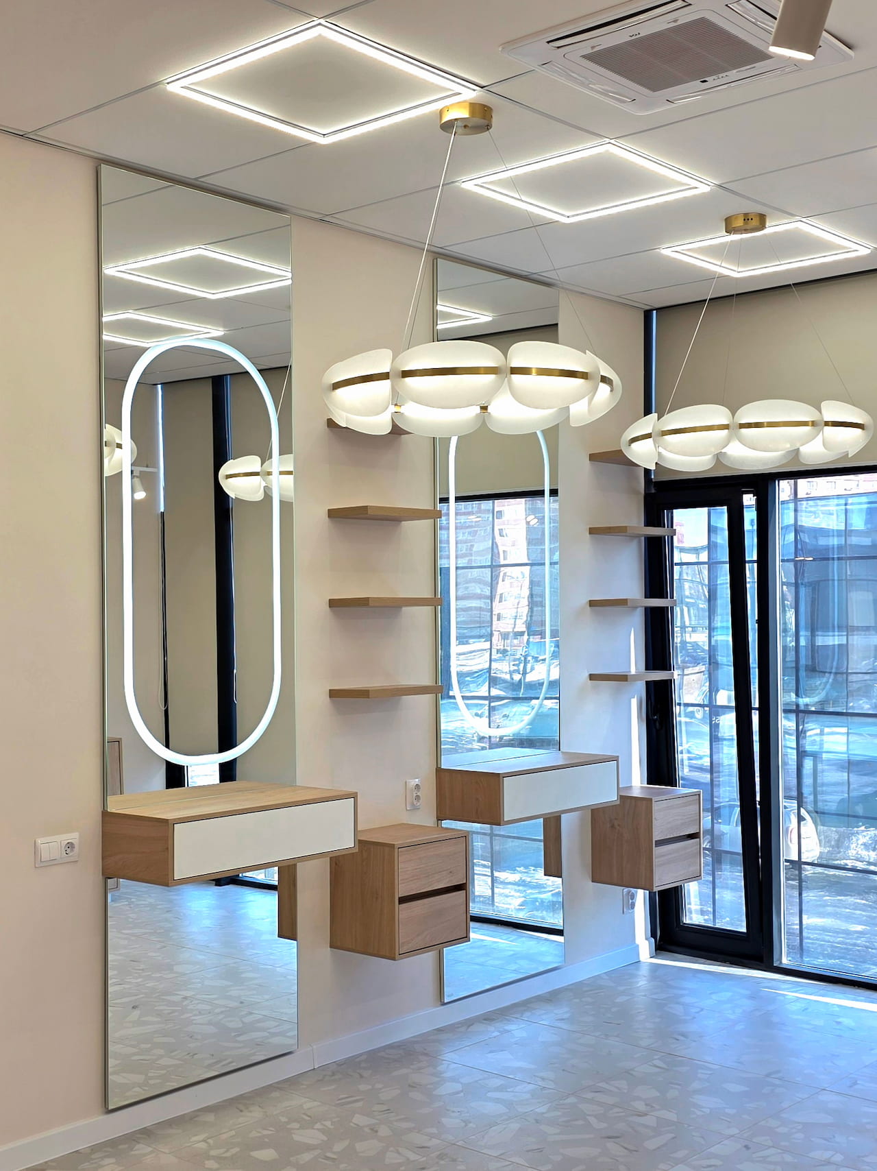
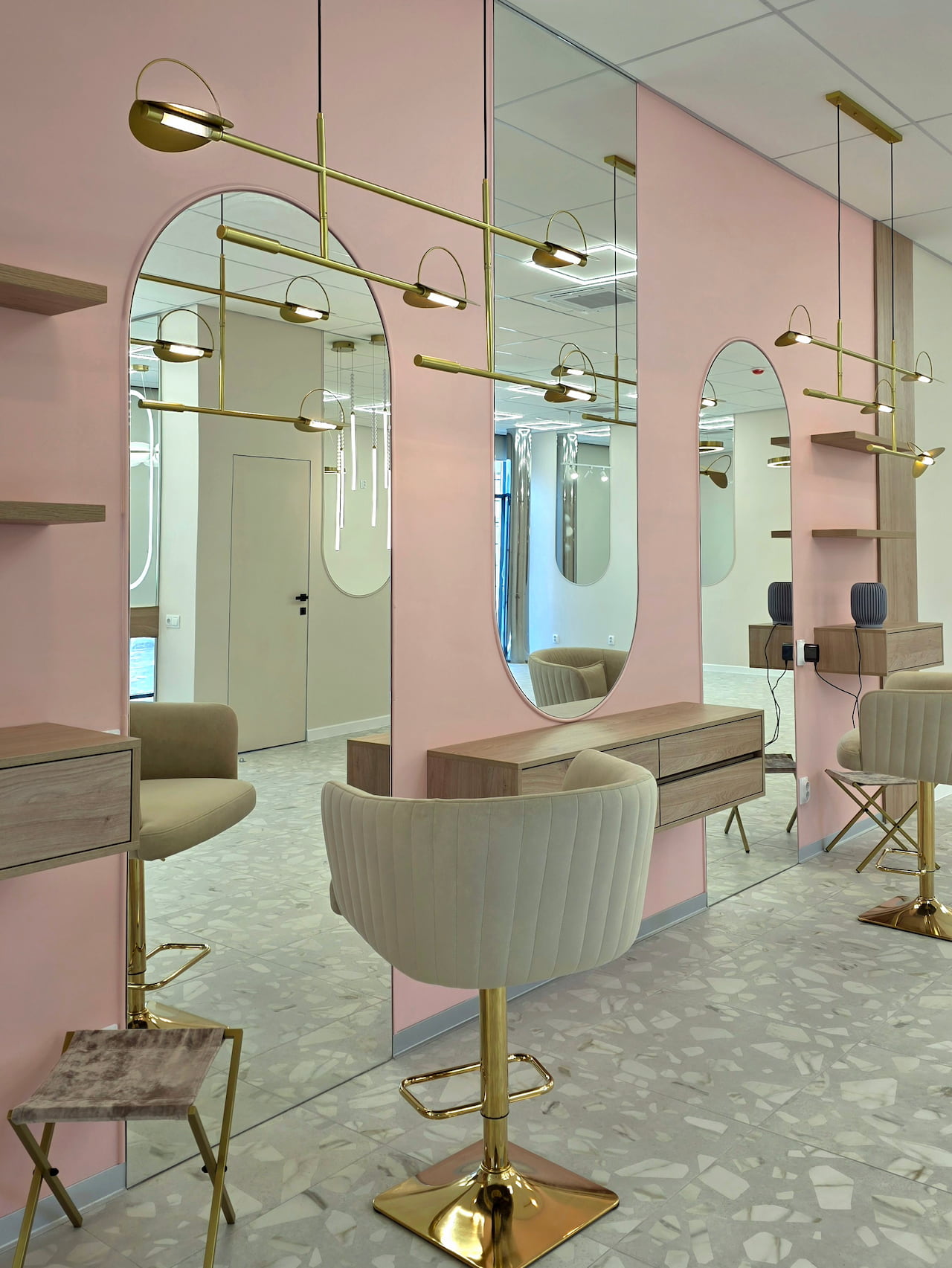
The Magic of 6500K Temperature: Working with Light That Saves Your Renovation
– In the Planoplan user community, you recently shared a very valuable insight about light temperature. Tell us more: how does Planoplan help you ‘negotiate’ technical details with the client?
By the way, thanks to this program, my client and I ordered lighting based on temperature. In theory, I understood how light affects wall color, but in Planoplan I demonstrated it visually. I created three renders of the same wall under three different color temperatures (warm, neutral, cool). My client and I looked at the screen and chose.
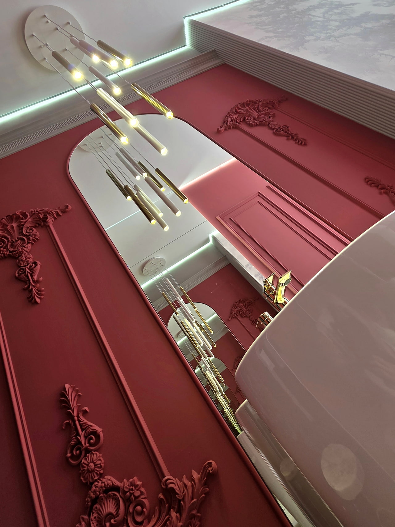
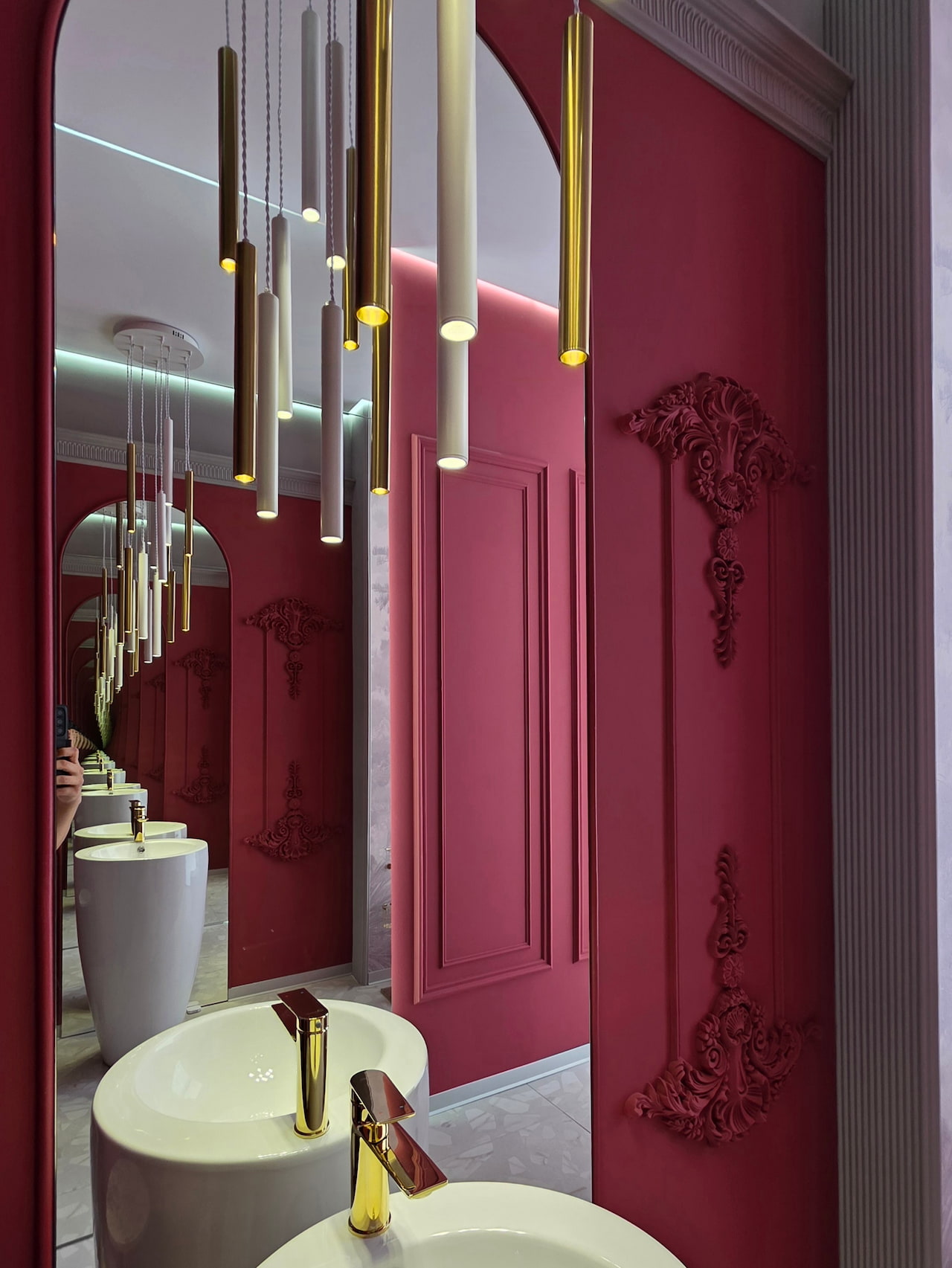
When I showed that at 6500K (cool daylight) our burgundy looks noble and deep, not ‘bloody,‘ the client immediately relaxed. In reality, we ordered the LED strip exactly at that temperature. The result — the walls matched the render 1:1. Unfortunately, photos don’t fully capture the difference, but in person it‘s 100% match.
The same applies to beige: it’s one of the most difficult shades to achieve in an interior because as soon as you install a warm lamp at 2700-3100K, you get a yellower beige; if you install a lamp at 6500K, your beloved beige wall turns cold. So as soon as we set the lamp color temperature to 4000K in the render, we immediately got that exact beige from the picture. And of course, only thanks to the ability to change light temperatures in this program and simultaneously adjust natural lighting to match the actual sun position on the site, we can first fall in love with the image and then with the execution that matches the image 1:1. Why? Because in this program, you just enter the initial color data and set the type of artificial and natural lighting, and voilà — for the 1:1 execution we use the required temperature lamps and the paint SKU embedded in the render.
Important for pros: beginner designers often underestimate the ‘Lighting’ section in design software. And that’s a mistake. Proper temperature settings save you from rework, material waste, and disappointing client comments like ‘that‘s not the right color.’
Perfect Renders
We’ve gathered all useful materials into a Learning Module. Master lighting, learn to choose the optimal render type for your task, and use the full potential of Planoplan to create breathtaking visualizations.
Why Planoplan Works for Complex Commercial Projects (Not Just Apartments)
– Your project has many complex elements: accent molding, gold accents, a photo zone with swings, a restroom worthy of Pinterest. Did the software handle the geometry and small details?
Absolutely. I showed the client not just a pretty picture but an actual working document.
- Material library: We applied gold and molding textures, and the client immediately saw not just plaster but the right ‘sheen.’
- Real furniture dimensions: We entered the dimensions of recliner chairs (for 6-hand procedures) and huge round mirrors in advance. In reality, everything fit perfectly.
- Waiting area and photo zone: Swings, a planter with a gold ring, bead lights — some of these items are shipped from China, but we already know they will fit because the render was built from actual blueprints.
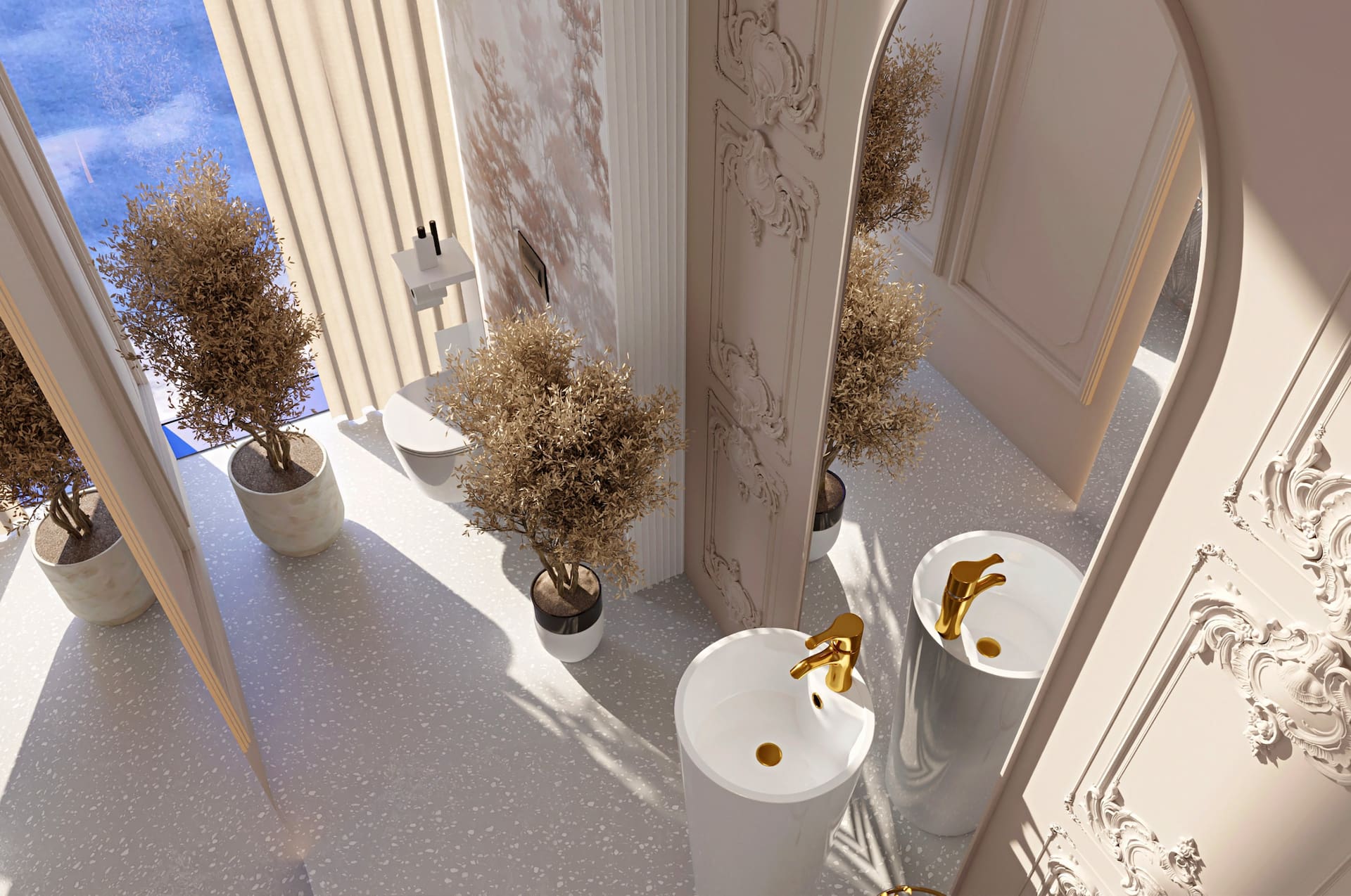
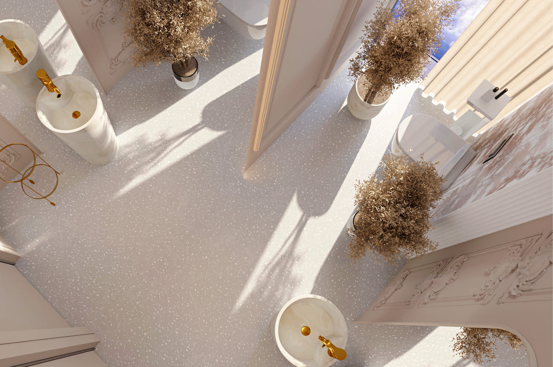
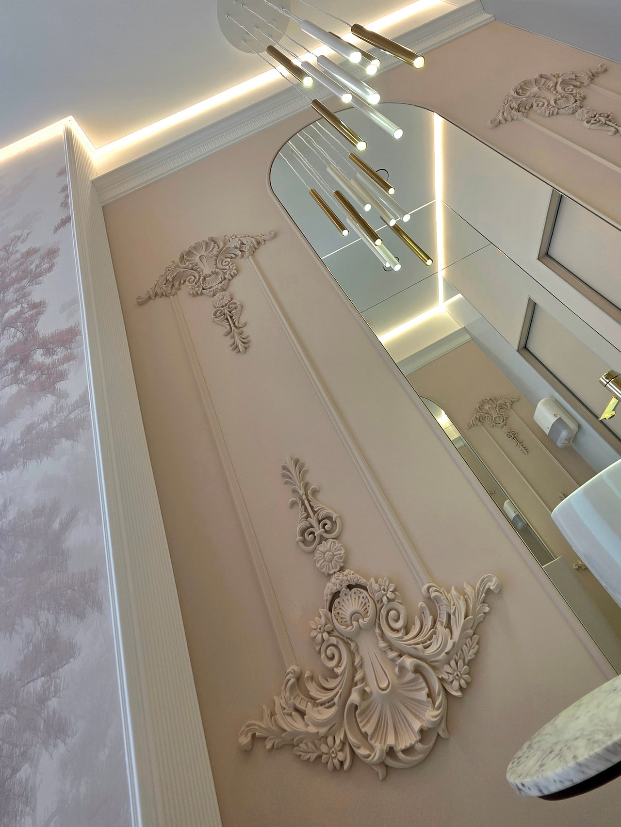
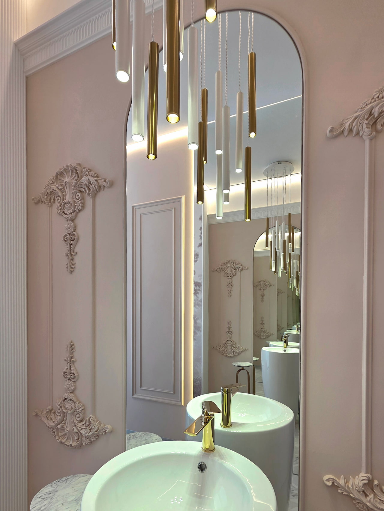
A special point of pride is the restroom. We did it in a deep berry color with arches and gold accents. The other one is exactly the same but beige. In Planoplan, we managed to capture every reflection on the enamel. Now people ask me for this room as a Pinterest reference.
Inside Look: How an Experienced Designer Masters Planoplan and What She‘ll Teach Others
– You joined the software not long ago, but you’ve already gotten comfortable and are planning your own training course. What won you over?
I‘ve worked in other CAD systems for many years, but Planoplan solves the main pain point for designers: speed of presenting an idea without losing quality. You don’t spend three days tweaking a single visual for complex lighting. The software delivers photorealism immediately if you understand the logic.
My future course is exactly about that: how not to ‘render for weeks‘ but to quickly give the client a clear image and create documentation that contractors understand. I want to show colleagues that premium-level commercial projects aren’t scary to do in Planoplan — on the contrary, it‘s a competitive advantage.
Conclusion: Predictable Results — The Designer’s Main Currency
The Studio Girls project is a pure demonstration of Planoplan‘s philosophy. There is no ‘expectation vs reality’ discrepancy here. The client got exactly what she saw on the monitor: the chosen light temperature, the precise burgundy shade, molding in the right places, and that ‘wow photo zone.‘
Planoplan is suitable not only for residential apartments. As Liliya shows, it’s a full-fledged tool for serious commercial work and for designers who value their time, reputation, and want to sleep soundly during renovation.
Have you already tried adjusting light temperature in your projects to achieve a ‘true-to-life‘ color? Join the Planoplan user chat — share your experience and learn from the best!