How to Gently Talk a Client Out of a Bad Interior Design Idea Without Losing the Project
5 tile layout scenarios that save both the renovation and your relationship with the client
- 4 june 2026
- 847
Sometimes a client falls in love with an idea that, in reality, would be a disaster. A flat-out "no" or "that’s wrong" will only spark conflict. Your job as a designer isn’t just to reject the idea — it’s to guide an unrealistic wish into a safe, aesthetically pleasing, and technically sound solution.
Below are 5 common tile-related traps that can derail a project, plus ready-to-use scripts to steer your client back on track.
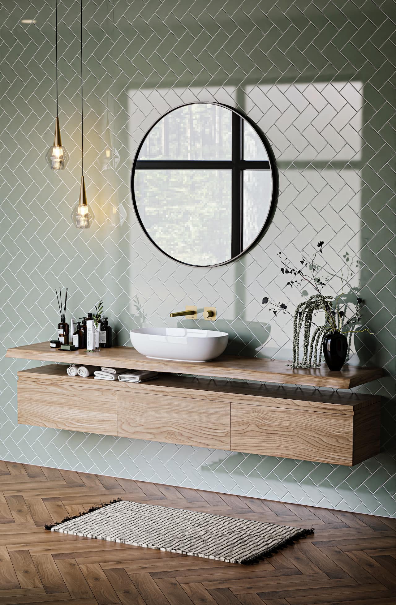
“I want a 1mm grout line, just like that Pinterest photo”
- The problem: Tile always has factory tolerances (tiny size variations). With a 1mm joint, those imperfections become glaringly obvious. Instead of a sleek, seamless look, you get a crooked, uneven mess.
- What to say: “I totally get wanting a monolithic floor — it looks expensive. But tiles always have slight size differences from the factory. With a 1mm joint, every tiny mismatch will jump out at you. Let’s do a 2–3mm joint instead, and match the grout color exactly to the tile. The lines will visually disappear, you’ll get that seamless effect you want, and the installation will be rock solid. I’ll show you in Planoplan’s 3D scene — you won’t even notice the difference.”
You’re not denying beauty — you’re offering a realistic way to achieve it.
“Let’s buy huge 1200×2400mm tiles for our old apartment”
- The problem: That format physically won’t fit up the stairs or in the elevator. You’d need specialized rigging and window access, which most building managers won’t approve. Plus, cutting tiles that size on-site isn’t possible — you’d need a custom workshop cut and complex logistics.
- What to say: “Those tiles are stunning, but delivering and getting them up to your apartment will cost more than the tiles themselves. Because of the size, we’d need to hire climbers for a window lift and send everything to a specialty shop for cutting. My suggestion: get the exact same look in a 600×1200mm format. It’s way cheaper, easier to install, and far more reliable. Let’s test it in Planoplan’s 3D scene — you’ll see the scale works perfectly.”
You’re shifting the focus to hidden costs. The client is now informed and can choose the practical alternative.
“I want a perfect flush transition between laminate and tile — no thresholds”
- The problem: Laminate is a floating floor that expands and contracts with humidity and temperature changes. If you grout it tight or butt it against tile, the laminate will buckle and its locking system will break.
- What to say: “I hear you — a seamless flow with no trip hazard looks great. But laminate moves — it expands with moisture. Without a dedicated expansion gap, your floor will buckle over time. To keep the clean look, we can use a slim metal transition strip matching the floor color. Or, if thresholds really bother you, let’s switch to glue-down LVT. That can be fixed solidly, and we can fill the joint with color-matched silicone caulk.”
You’re protecting the project from guaranteed callbacks six months later.
“Why would we use any plain tile? I want a mix of different shapes and patterns — let’s skip the background tile entirely”
- The problem: If you remove all the “quiet” background tile and only use multiple complex shapes and prints, the interior becomes chaos. Without a calm visual rest, expensive materials fight each other, eat up the space, and ruin the architectural logic.
- What to say: “I agree, a completely plain look can be boring. But if we remove any background and combine every active shape and pattern at once, they’ll turn into a kaleidoscope and cancel out each other’s beauty. Let’s pick just two main features — say, one interesting shape and one strong pattern. We’ll compose them so they enhance each other and add depth, not visual noise. I’ll show you in Planoplan’s 3D scene how great that will look.”
You’re preserving compositional balance, rhythm, and a portfolio you’ll be proud of — no visual clutter.
“I want patchwork, large honeycombs, and busy mosaic”
- The problem: These are overused, tired trends that quickly look dated and cheapen the interior. Your role is to offer a current, upscale alternative that keeps the client’s core desire (geometry, rhythm, graphic interest).
- What to say: “Patchwork and large honeycombs were popular a few years ago, but they’ve fallen out of trend. If you love graphic patterns and history, let’s use encaustic cement tiles instead — that’s timeless. Swap large honeycombs for small honeycomb mosaic — it’s much more elegant. And replace the busy mosaic with a refined solid tone without cheap glitter. The shape stays, but the look will be a whole level more sophisticated.”
You’re gently educating the client’s taste and creating lasting design that won’t feel outdated in a year.
Quick Tip to Speed Up Approvals
The easiest way to convince a hesitant client is to show them the real layout. Explaining with hand gestures or drawing layouts manually takes forever. In Planoplan, you can set up the tiling plane in a few clicks, define the exact joint width, choose the right pattern, and instantly show the difference between a 1mm and a 3mm grout line — or demonstrate how too many busy collections overcrowd a small bathroom. This saves hours of work and prevents endless arguments.
Speaking of layouts: Planoplan has recently added around 30 tile layout patterns. Open the program and see for yourself how flexible and easy the new update is.
Universal 3-Step Rejection Formula
If a client’s idea is technically flawed but doesn’t fit the scenarios above, use this algorithm:
- Acknowledge the value
“I see why you like it — visually, it’s very striking.” - Name the barrier (physics or building codes only)
“But from a real-world installation / material properties standpoint, here’s the issue: [state the problem].” - Offer an alternative
“Let’s do this instead. We’ll get the same visual effect, but without the risk of cracks and cost overruns.”
Key point: Your goal is to protect the project and save the client from mistakes made with their own money. When you frame a rejection around benefits to their wallet and renovation quality, you instantly shift from “someone who just draws pretty pictures” to an indispensable expert.
Checklist Before You Say “No”
- Have I understood exactly what aesthetic effect the client really wants? (Not “1mm grout” but “seamless look.”)
- Do I have a ready, safe alternative that delivers the same visual?
- Am I basing my argument on material physics or building standards — not just “I don’t like it”?
- Can I quickly show this in a render or Planoplan’s 3D scene?
- Am I leaving the final choice with the client (and documenting the risk in a sign-off if needed)?